Delivery Command Center
Delivery Command Center is a tenant-wide executive rollup, one layer above Home — every project with an active sprint, blended into Portfolio Health, Delivery, Capacity, Quality, and Dependencies, plus a ranked Top 5 Delivery Concerns table and two trend charts. Every number is read from data Risk Management, Sprint Capacity, and Time Logs already persist; nothing here recalculates from scratch.
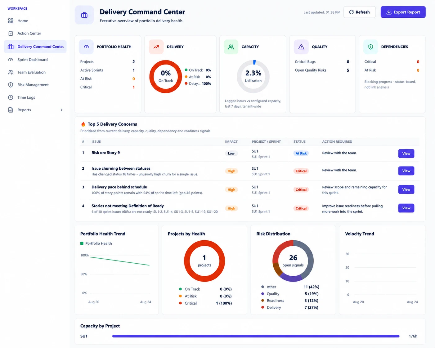
The Portfolio Health score, exactly as computed
A 0-100 score, averaged across every currently-analyzed active sprint, then adjusted once for tenant-wide capacity:
1. Each sprint gets a health score
100 − deliveryPenalty − dorPenalty − riskPenalty, clamped to 0-100. A sprint that's never been analyzed in Risk Management contributes to nothing here — it's silently excluded, not counted as risk-free.
2. Three penalties, each threshold-based
Delivery penalty (from Delivery Gap = Remaining Work % − Remaining Time %): 30 pts if the gap is ≥25 points (critical), 18 pts if ≥15 (high), 8 pts if ≥5 (medium), 0 below that. DOR penalty (from the % of sprint issues not yet ready): 20 pts if ≥40% not ready, 12 pts if ≥25%, 5 pts if ≥10%, 0 below that. Risk penalty: min(40, critical×10 + high×5 + medium×2) from that sprint's open risk counts.
3. Averaged, then one capacity overlay
All analyzed sprints' scores are averaged, then −10 if tenant-wide capacity utilization is critical (≥100%) or −5 if high (≥85%) — a single portfolio-wide adjustment, not per-sprint. The final score rounds to a whole number and maps to a status: ≥80 On Track, ≥60 At Risk, below that Critical (or "No data" if nothing's been analyzed yet).
The KPI row
| Card | What it actually measures |
|---|---|
| Portfolio Health | Projects, active sprints, at-risk and critical project counts, plus the score above |
| Delivery | Analyzed sprints bucketed On Track / At Risk / Delayed by the same delivery-gap severity used in the health formula |
| Capacity | Tenant-wide: total hours logged (via Time Logs) ÷ total configured Dev+QA hours across every discovered sprint, over the last 7 days — not split by project or team |
| Quality | Critical Bugs (Bug type, Highest priority, unresolved — one cheap Jira count) + Open Quality Risks (how many quality-category risk rows are currently open tenant-wide) |
| Dependencies | Open dependency-category risk rows, split Critical vs. At Risk by severity |
Top 5 Delivery Concerns — the ranking formula
1. Deduplicate first
Every open risk candidate (critical, high, or medium severity, tenant-wide) is grouped by (sprint, category), keeping only the single highest-scoring row per group — so three capacity-flavored rules firing on the same sprint surface as one attention item, not three.
2. Score what's left
attentionScore = severityWeight × categoryUrgency × breadth. Severity weight: critical=3, high=2, medium=1. Category urgency: Delivery=1.3, Dependency=1.2, Capacity=1.1, DOR=1.1, Quality=1.0 (hand-picked, not learned). Breadth = how many of the deduplicated candidates share the same underlying rule code — a signal firing across more sprints ranks higher.
3. Take the top 5
Sorted by attentionScore descending. Each row keeps its severity-based Impact label (critical→High, high→Medium, medium→Low) and the same recommended action text the underlying rule always produces.
Two trend charts, same caveat
Portfolio Health Trend and Velocity Trend both read the last 6 sprints whose most recent analysis fell within the last 180 days — not each sprint's own Jira calendar dates, because the underlying table only ever keeps the latest analysis per sprint (the same caveat Trends & History documents elsewhere). Portfolio Health Trend re-runs the per-sprint health formula (delivery + DOR + risk penalties only, no capacity overlay) for each of those 6 points. Velocity Trend plots completed story points — committed minus remaining, as of each sprint's last analysis — not live, real-time burndown.
Capacity by Project
A bar list of each project's total configured capacity in hours (Dev + QA hours set in Sprint Capacity), sorted highest first. This is deliberately not a per-project utilization percentage — that would need a separate logged-hours query per project, which this dashboard avoids to stay cheap. For the one tenant-wide utilization number this page does compute, see the Capacity KPI card above.
What's deliberately left out, and why
- No Forecast card, even though the backend computes an
onTimeProbabilityPctvalue internally — it's deliberately not rendered here. A single portfolio-wide probability number was judged less honest than showing it scoped to one sprint at a time, which is what Sprint Intelligence does instead. - No day-over-day change indicators or "vs. yesterday" deltas anywhere on this page — that needs a persistent snapshot/diff capability that doesn't exist yet, not something worth faking with a single reading.
- Capacity Utilization is tenant-wide only, not per-project or per-team, for the same cost reason Capacity by Project stays at configured-hours only.
- Portfolio Health's weights (the penalty values above) are explicitly called out in the code as needing validation against historical data before they're treated as calibrated — today they're a reasonable, fully-explainable starting point.
Magic Wand — 8 panels
Exact explanation text, verbatim from each panel's explainer function:
Portfolio KPIs
"Portfolio Health rolls up every active sprint's delivery pace, issue readiness, and open risk signals into one 0-100 score across N projects... It is a first-pass deterministic model, not a calibrated prediction." Recommends starting with the Top 5 list whenever at least one project is critical.
Top 5 Delivery Concerns (list)
"These are the highest-ranked open risk signals across every active sprint, deduplicated so the same underlying problem... surfaces once, not three times. Ranking = severity x category urgency x how many sprints show the same signal."
Each concern row, individually
A per-row explainer reads that item's own description, severity, impact, and — when the same signal shows up on more than one sprint — a note that "the same underlying signal is showing up on N active sprints right now."
Risk Distribution
"Every currently-open risk signal across all active sprints, grouped by category... Same category taxonomy Risk Management already uses per sprint, just totalled across the whole portfolio."
Capacity by Project
"Each project's total CONFIGURED capacity (Dev + QA hours set in Sprint Capacity) — not actual logged-hours utilization per project, which would need a heavier per-sprint query this dashboard deliberately avoids."
Projects by Health
"Every project with at least one analyzed active sprint, bucketed by that sprint's health score... same bucketing the Portfolio Health card uses per sprint, rolled up to one status per project."
Portfolio Health Trend
Explains the "last N analyzed sprints" caveat directly, plus whether the trend is heading up, down, or flat versus the earliest point shown.
Velocity Trend
"Completed story points (committed minus remaining, at last analysis) for the last N analyzed sprints, tenant-wide. Same 'last analyzed' caveat as Portfolio Health Trend applies here too."
Ask Sprint Advisor about this page
| Skill | What it actually does | Permission |
|---|---|---|
| Explain this page | Returns the real page description: "...Portfolio Health, Delivery status, Capacity utilization, Quality signals, and Dependencies, a ranked Top 5 Delivery Concerns table, and trend charts. Capacity by Project shows each project's configured capacity in hours, not a per-project utilization percentage. There are deliberately no day-over-day change indicators here yet..." | None beyond Advisor.View |
commandCenterSummary | Narrates the live payload in one sentence — active sprint count, Portfolio Health score with at-risk/critical project counts, and delivery status, computed fresh from the same 7-day window the dashboard itself uses | None beyond Advisor.View |
commandCenterTopConcerns | Reads the #1 ranked item from the exact same Top 5 Delivery Concerns list and states its title, project, description, and recommended action — or honestly says no significant signals are open if the list is empty | None beyond Advisor.View |
Both skills are tenant-wide, not scoped to a single sprint — the same bridge Home uses for its own Advisor skills, keyed by the deliveryCommandCenter page ID so Advisor only trusts this portfolio-wide context while this page is actually open.
Permissions
Delivery Command Center has no permission gate — navConfig.js lists it with permission: null, same as Home and Action Center. Anyone who can open the app can see the portfolio rollup, built from whichever projects they already have access to.
How anyone gets value out of this
Rating this page
Anyone reading this documentation can mark whether it answered their question — no permission required. It doesn't change anything in the app; it just helps the SprintUnity team prioritize which pages to improve next.