Sprint Compare
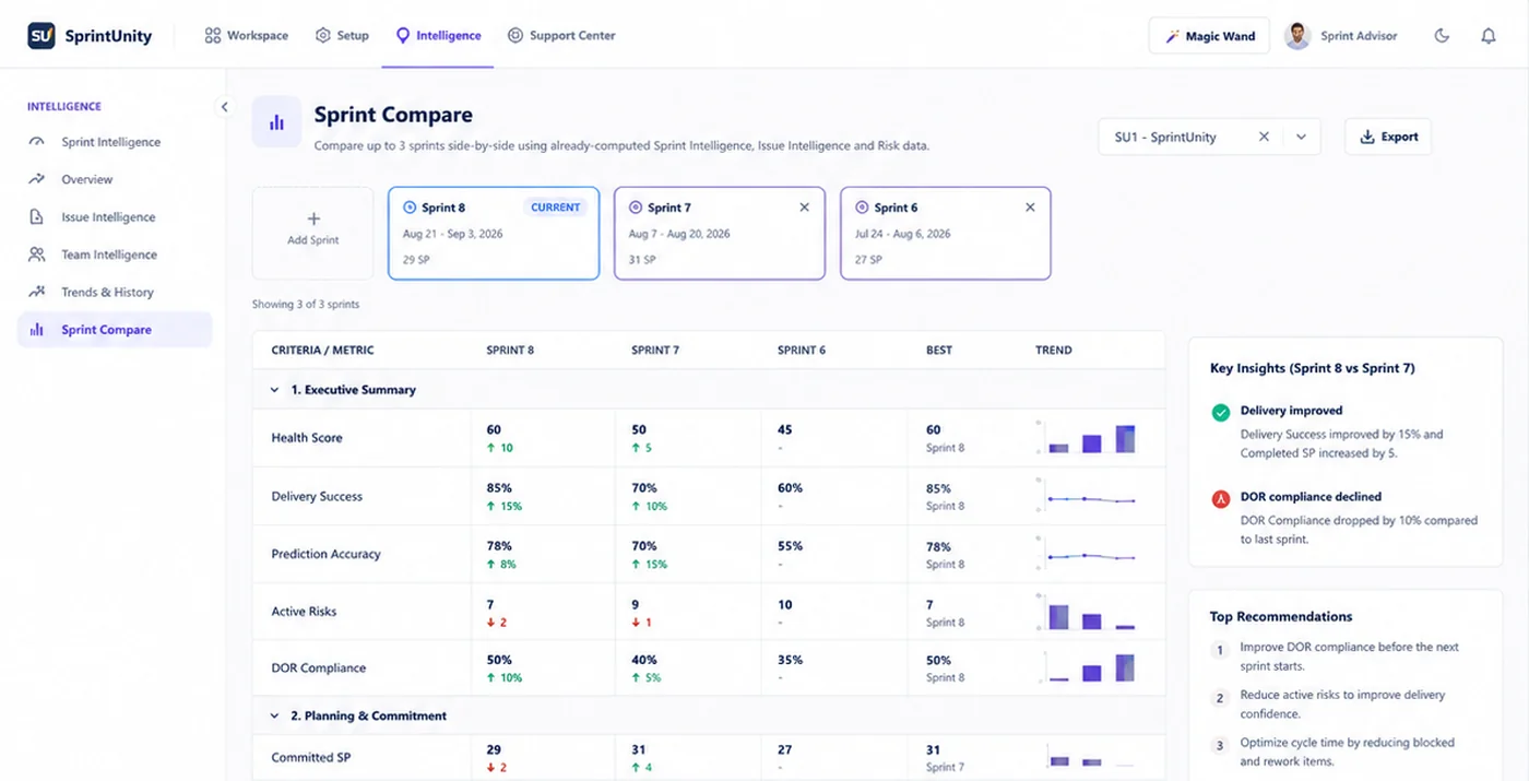
See exactly what changed, sprint after sprint. Compare up to 5 sprints side-by-side using data SprintUnity has already computed — Sprint Intelligence, Issue Intelligence and Risk snapshots — lined up in one table with trend arrows, a "Best" column, and a set of automatically generated Key Insights and Recommendations.
What it means, and what you're actually looking at
Found under Dashboard → Sprint Compare. Pick a project, then add sprint cards at the top — up to 5 at a time. The comparison runs live: as soon as 2 or more sprints are selected, the full table below fills in automatically, no separate "Compare" button to click. Remove a sprint by clicking the × on its card, or add another as long as you're under the 5-sprint limit. By default, the page pre-selects the active sprint (if there is one) plus up to 4 of the most recently closed sprints, newest first, so there's already something useful on screen the first time you open it.
Selected sprints are ordered most-recently-selected first, and every "vs previous" comparison in the table — the delta arrows, the Key Insights sidebar — reads that as this sprint vs. the one immediately to its right, not vs. the oldest sprint or an average. If you want "Sprint 8 vs Sprint 7," add Sprint 8 first.
Where the numbers actually come from
Every metric in Sprint Compare is a read from data another feature already calculated and stored — nothing is computed fresh for the comparison itself:
Sprint & Issue Intelligence snapshots
Health Score, the 5 health pillars, delivery confidence, prediction accuracy, cycle/lead time and issue-type counts all come from the same snapshot rows Sprint Intelligence & Health already writes when a sprint is recalculated.
Risk summaries
Open/critical/high/medium/low risk counts and the resolution rate come from the same risk data behind Sprint Risk Management.
Readiness (DOR) numbers
DOR compliance and readiness scores reuse the exact same not-ready count that powers Definition of Ready (DOR)'s sprint-wide numbers.
Time Logs and Sprint Capacity
Logged hours and capacity utilization are best-effort reads — if a sprint never had capacity limits set, or nothing was logged, that row simply shows a dash rather than failing the whole comparison.
Because it's a pure read, comparing sprints is a handful of indexed database lookups rather than a new background job — there's no extra async processing step behind this page the way there is for the intelligence snapshots themselves.
The 10 sections — 6 live today, 4 marked "Soon"
The comparison table is organized into 10 numbered criteria groups, matching the product's full comparison design. Six read real, already-computed data today; four are visibly present with a Soon badge rather than silently hidden or shipped with placeholder numbers, because the data source each needs (Team Intelligence, Team Evaluation, or a per-status timestamp history) isn't read by Sprint Compare yet.
| # | Section | What it covers | Status |
|---|---|---|---|
| 1 | Executive Summary | Key metrics overview across selected sprints | Live |
| 2 | Planning & Commitment | Issue mix and sprint capacity | Live |
| 3 | Delivery & Forecast | Delivery execution, progress and forecast accuracy | Live |
| 4 | Sprint Health | Overall health and its 5 key dimensions | Live |
| 5 | Risks & Issues | Risk exposure, resolution and issue quality | Live |
| 6 | Readiness & Quality | Issue readiness (DOR) and quality indicators | Live |
| 7 | Contribution & Roles | Team contribution distribution and role performance | Soon |
| 8 | Evaluation | Estimation accuracy and evaluation performance | Soon |
| 9 | Time & Process Flow | Cycle times, lead times and process efficiency | Soon |
| 10 | Recommendations | Every recommendation from this comparison, in one numbered list | Live |
Each of the 4 "Soon" sections shows an honest note in place of the data: "This section needs data Sprint Compare doesn't read yet (from Sprint Capacity, Team Intelligence or Team Evaluation). It'll be wired up in a follow-up pass rather than shipped with placeholder numbers." Readiness & Quality also carries a smaller footnote today: its bug-type breakdown (Functional / UI-UX / Integration) isn't included yet, since it needs a per-issue scan that isn't part of the current snapshots.
Every metric in the 6 live sections
Each group row expands into its own child rows — one per metric. This is the full list of what's actually compared today:
1. Executive Summary — 8 metrics
Health Score, Delivery Success (%), Completion Rate (%), Prediction Accuracy (%), DOR Compliance (%), Rework Rate (%, lower is better), Active Risks (lower is better), Avg Cycle Time (days, lower is better).
2. Planning & Commitment — 7 metrics
Number of Issues, Stories, Bugs (lower is better), Developer Capacity (h), QA Capacity (h), Total Capacity (h), Capacity Utilization (%).
3. Delivery & Forecast — 7 metrics
Committed SP, Completed SP, Forecast SP, Completion Rate (%), Delivery Confidence (%), Avg Cycle Time (days, lower is better), Avg Lead Time (days, lower is better).
4. Sprint Health — 5 metrics
The same 5 weighted pillars documented on Sprint Intelligence & Health: Scope, Schedule, Capacity, Quality, Risk — each 0–100, each shown per selected sprint.
5. Risks & Issues — 6 metrics
Open Risks (lower is better), Critical, High, Medium, Low (all lower is better), Resolved (higher is better).
6. Readiness & Quality — 7 metrics
DOR Compliance (%), Avg Readiness Score, Ready Stories, Not Ready (lower is better), Rework Rate (%, lower is better), Reopened Issues (lower is better), Bug Count (lower is better).
40 metrics total across the 6 live sections — every one of them a plain read of a number another feature already computed, not a new formula invented for this page.
Reading a row — Best, Trend, and the delta arrows
The delta arrow (▲ / ▼)
Each cell's small tag compares that sprint's value to the column immediately to its right — since sprints are ordered most-recently-selected first, this always reads as "this sprint vs. the previous one." The arrow and color depend on whether higher is better for that specific metric (set per-row — e.g. Rework Rate and Bug Count are "lower is better," so a decrease shows as an improvement, not a decline).
The "Best" column
Highlights whichever selected sprint had the strongest value for that row, using the same higher/lower-is-better flag. This is a purely client-side visual highlight — the backend never picks a "winner," it only ever returns each sprint's raw numbers.
The Trend mini-chart
A small bar chart per row, one bar per selected sprint, colored to match that sprint's card. It's a real chart with an axis — the max value and 0 are both labeled, and hovering a bar shows the exact number — not a vague sparkline shape. It's hand-drawn inline SVG, not a third-party charting library.
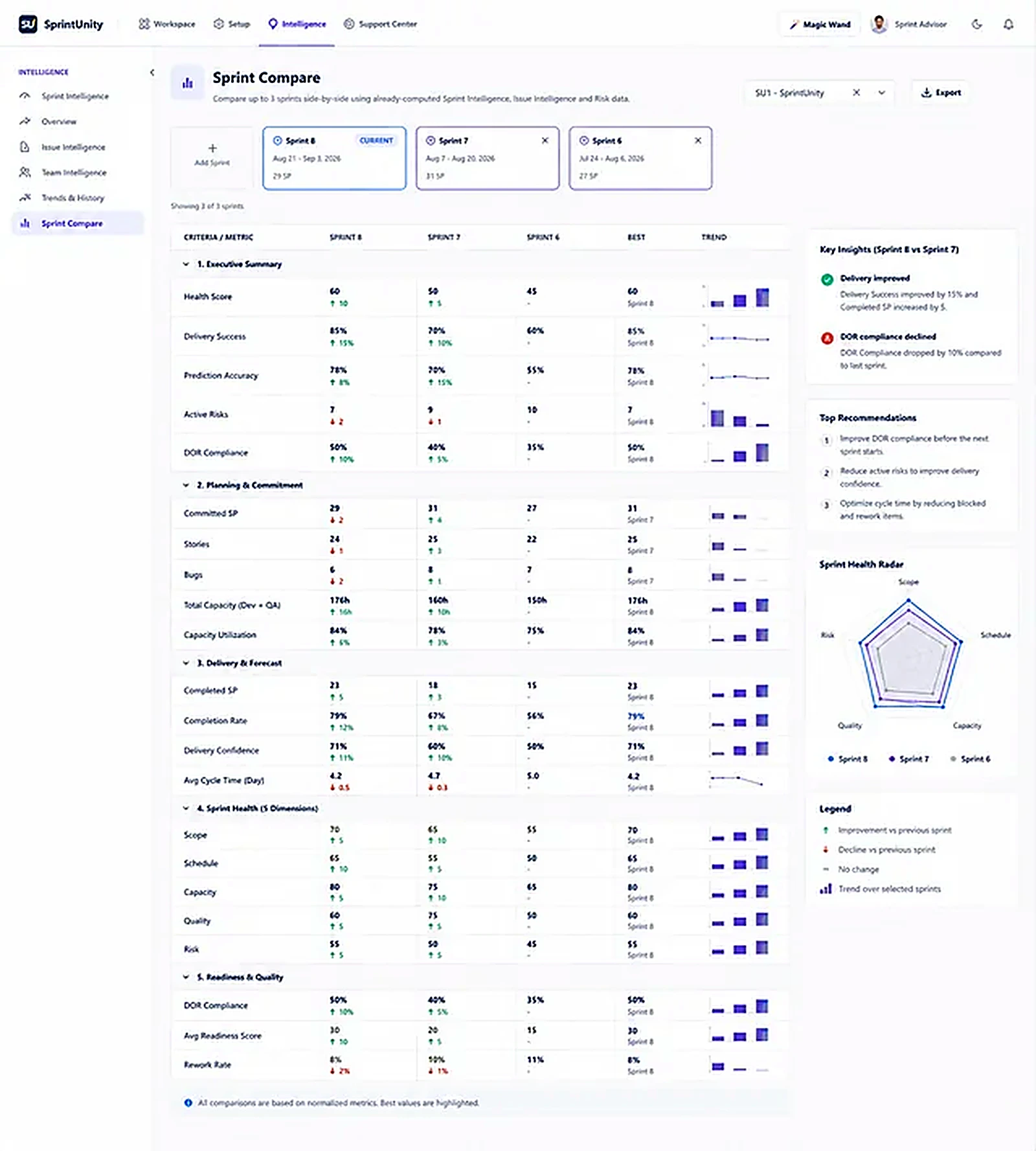
The Sprint Health Radar
Alongside Key Insights and Top Recommendations, the sidebar also plots a radar (spider) chart of the same 5 Sprint Health pillar scores from section 4 — Scope, Schedule, Capacity, Quality and Risk as the five axes, one colored outline per selected sprint, matching each sprint card's color. It's a different view of numbers you can already read row-by-row in the table — useful for spotting at a glance whether one sprint's shape is more balanced or more lopsided than another's, rather than reading five separate percentages.
A small Legend sits under the radar chart to spell out the shared conventions used across the whole page: ▲ improvement vs. the previous sprint, ▼ decline vs. the previous sprint, — no change, and the little bar icon means "trend over the selected sprints" — the same Trend mini-chart described above.
 1 / 6
1 / 6
Key Insights and Top Recommendations — how they're actually generated
The sidebar next to the table has two cards, both computed the same way the rest of the app generates plain-language output: fixed rule templates with real numbers substituted in — never an AI or LLM call. Every sentence you see here can be traced back to one of these rules:
Key Insights
Compares only the two most recently selected sprints (current vs. previous) on 5 specific fields, and only mentions a field if it actually changed:
| Field compared | Direction that counts as "improved" |
|---|---|
| Delivery Success | Higher |
| DOR Compliance | Higher |
| Prediction Accuracy | Higher |
| Rework Rate | Lower |
| Active (open) Risks | Lower |
Each produces a sentence like "Delivery success improved by 12%" or "Rework rate declined by 4%." A 6th rule fires separately whenever critical risk count went up: "2 critical risks detected (was 0)." Up to 6 insights are shown, most significant first.
Top Recommendations
A short, ordered checklist built from fixed thresholds against the most recent selected sprint's own numbers (not compared to any other sprint):
Any critical risk open
→ "Review the critical risk and mitigation plan."
Rework rate ≥ 15%
→ "Investigate issues with repeated QA cycles or rework."
Sprint Health's Capacity pillar < 60
→ "Reduce committed scope or increase available capacity next sprint."
DOR compliance < 80%
→ "Improve Definition of Ready compliance before the next sprint starts."
High + Critical risks ≥ 3 combined
→ "Close or downgrade high-severity risks before committing new scope."
Up to 5 recommendations are shown. If none of the 5 rules fire, the list shows a single reassuring line instead of staying empty: "No urgent action items — sprint metrics are within healthy ranges." This same Recommendations list is also what fills section 10 of the main table.
Exporting a comparison
The Export button (top-right, next to the project picker) becomes active once a comparison is loaded. It builds a CSV entirely in the browser — Section, Metric, and one column per selected sprint, covering Executive Summary, Planning & Commitment, Delivery & Forecast, Sprint Health, Risks & Issues and Readiness & Quality — and downloads it immediately. No server round-trip and no separate export permission: if you can see the comparison, you can export it.
| Permission | What it controls |
|---|---|
CompareSprints.View | Open Sprint Compare, select sprints, view the comparison, export CSV, and ask Sprint Advisor about this page |
Sprint Compare is read-only end to end — it has exactly one permission. There's no separate Edit or Delete permission, because the page never writes anything; it only ever reads numbers other features already computed and stored.
Magic Wand — explain any of the 6 live sections in depth
While Magic Wand is armed (the toggle lives in the app header), clicking any live section's row — instead of expanding it — opens a structured explanation instead: What it means, a few plain-language observations about the two most recently selected sprints, any risks worth flagging, and one concrete recommendation. Each of the 6 sections has its own explainer function reading only that section's own numbers — deterministic and rule-based, the same "no LLM, no external call" philosophy as every other Magic Wand panel in the app.
Executive Summary
Reports Health Score, Delivery Success and DOR Compliance with their trend vs. the previous sprint; flags rising active risks or a rework rate ≥15%; recommends opening Sprint Health if the score is below 60.
Planning & Commitment
Reports issue/story/bug counts and capacity utilization; flags utilization over 100% or bugs making up more than 30% of the sprint's issues.
Delivery & Forecast
Reports SP completed vs. committed, delivery confidence, prediction accuracy and cycle time; flags a forecast tracking under what was committed.
Sprint Health
Names the weakest and strongest of the 5 pillars by value, flags a health score that dropped more than 5 points vs. the previous sprint, and recommends the specific page to check next based on which pillar is weakest.
Risks & Issues
Reports open/critical/high risk counts and the closure rate; recommends reviewing the mitigation plan if any critical risk is open.
Readiness & Quality
Reports DOR compliance, bug count, reopened issues and rework rate; flags a rework rate ≥15% or DOR compliance that dropped vs. the previous sprint.
Ask Sprint Advisor about this
Sprint Advisor's suggested question here is "Explain this page" (no permission required beyond already being able to see the page). It answers: "Sprint Compare lines up to 5 sprints side-by-side using already-computed Sprint Intelligence, Issue Intelligence and Risk data — Executive Summary, Planning & Commitment, Delivery & Forecast, Sprint Health, Risks & Issues, and Readiness & Quality, plus a Recommendations list. Add or remove sprint cards at the top to change what's compared, and expand any criteria row to see its metrics. Magic Wand can explain any of the six criteria rows in more depth." Bilingual, English or Arabic. For a deep dive into one specific section's numbers rather than the page as a whole, Magic Wand (above) is the tool built for that — Sprint Advisor's chat skill for this page is deliberately just the page-level overview. See AI Sprint Assistant for how Sprint Advisor and Magic Wand work together across the rest of the app.
What comparing sprints is actually for, and who benefits
The value isn't the table itself — it's what a real side-by-side comparison replaces: a retro conversation running on memory instead of numbers. Without it, "did we improve?" is a matter of opinion; with it, it's a set of deltas anyone in the room can see. A few concrete ways different people get value from the same comparison:
CompareSprints.View can open a comparison and get the same Key Insights and Recommendations another teammate would see — there's no separate "manager view" with different numbers. The satisfaction widget below is available to every reader of this documentation page, not gated by a permission, so feedback on whether this page actually answered someone's question comes from the whole team, not just admins.Rating this page
Anyone reading this documentation can mark whether it answered their question — no permission required. It only helps the SprintUnity team see which pages need more detail.